Accumulation Distribution Indicator (ADI)

The Accumulation/Distribution Indicator, or ADI, is a volume-based indicator that helps traders gauge the underlying strength of a trend. Developed by Marc Chaikin, it goes beyond simple price action by integrating volume to determine whether a stock is being accumulated (bought) by investors or distributed (sold). By observing the relationship between the ADI line and the price chart, a trader can spot divergences that often precede significant trend reversals.
This lesson will cover the mathematical foundation of the ADI, how to interpret its signals, and practical strategies for applying it in the Indian markets.
The core idea is simple: if a stock closes near its high on significant volume, there’s strong buying pressure. If it closes near its low on high volume, selling pressure is dominant. The ADI line is a cumulative total of this volume-weighted price action.
The ADI Formula
The ADI calculation involves three steps. First, we calculate the Money Flow Multiplier, which determines the strength of the close relative to the period’s high-low range.
1. Money Flow Multiplier (MFM)
The MFM ranges from +1 to -1. A close at the high of the session gives a +1, while a close at the low gives a -1. A close exactly in the middle of the range gives a 0.
If the high equals the low (a zero-range day), the MFM is treated as zero.
2. Money Flow Volume (MFV)
Next, we multiply the MFM by the volume for that period to get the Money Flow Volume. This step weights the volume by the closing price’s position.
3. Accumulation/Distribution Line (ADI)
Finally, the ADI is a running total of the Money Flow Volume. Each new period’s MFV is added to (or subtracted from) the previous ADI value.
Because it’s a cumulative indicator, the starting point for the ADI calculation is arbitrary; only its subsequent direction and its divergence from price matter.
How to Calculate the ADI
Let’s walk through a calculation with some sample data for a stock.
| Day | High | Low | Close | Volume |
|---|---|---|---|---|
| 1 | 105 | 100 | 104 | 10,000 |
| 2 | 106 | 103 | 103.5 | 12,000 |
Day 1 Calculation:
- Calculate MFM:
- Calculate MFV:
- Calculate ADI: Since this is the first period, ADI = MFV. So, ADI = 6,000.
Day 2 Calculation:
- Calculate MFM:
- Calculate MFV:
- Calculate ADI:
The ADI line has now moved from 6,000 to -2,004, indicating that despite the volume, the selling pressure (distribution) on Day 2 was strong enough to erase the accumulation from Day 1.
How to Read the ADI Line
Interpreting the ADI is about observing its slope and its relationship with price.
- Rising ADI: Indicates that the stock is under accumulation (buying pressure). This can confirm an existing uptrend or suggest a potential bottom is forming.
- Falling ADI: Indicates the stock is under distribution (selling pressure). This can confirm a downtrend or suggest a potential top is forming.
- Non-Confirming ADI: When the ADI moves sideways while the price continues to trend, it signals a lack of conviction from volume. This suggests the trend is weak and may be prone to reversal.
Trading with ADI: The Power of Divergence
The most powerful application of the ADI is identifying divergences. A divergence occurs when the price is moving in one direction, but the ADI is moving in the opposite direction. This signals that the volume is not supporting the price trend, often acting as a leading indicator for a reversal.
Bullish Divergence (Accumulation)
A bullish divergence occurs when the price is making new lows, but the ADI fails to make a new low and instead starts making higher lows. This indicates that while the price is falling, selling pressure is decreasing, and buyers are quietly accumulating the stock.
The chart above shows a classic example. The price carves out lower lows, luring in short-sellers. However, the ADI line beneath it is forming higher lows, signalling that the “smart money” is absorbing the selling pressure. This divergence is a strong hint that the downtrend is losing its momentum and a bullish reversal is on the cards.
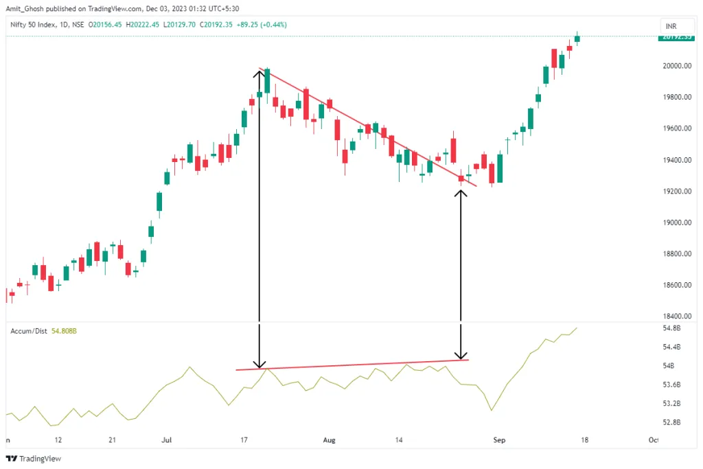
Bearish Divergence (Distribution)
Conversely, a bearish divergence happens when the price is making new highs, but the ADI is making lower highs. This suggests that even as the price pushes upward, the buying momentum is fading, and sellers are beginning to distribute their holdings.
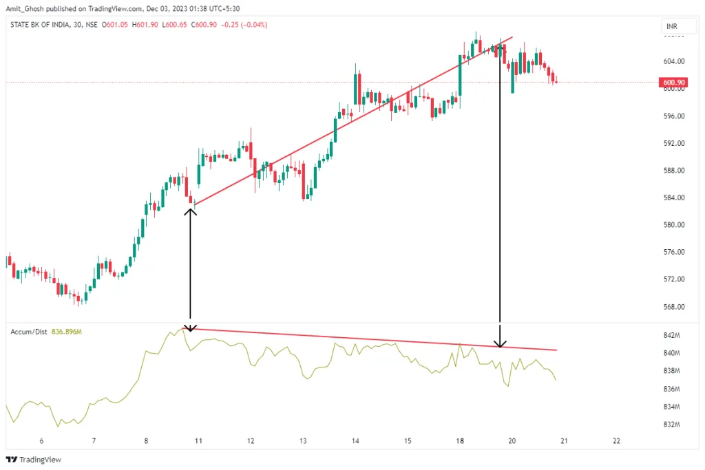
As seen in the chart, the price makes higher highs, giving a false sense of security to breakout traders. But the ADI is failing to confirm this strength, instead forming a lower high. This is a red flag indicating that conviction behind the rally is weak.
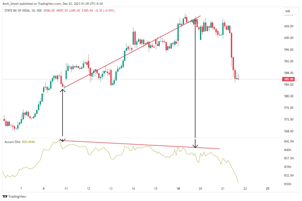
The subsequent image shows the outcome: the bearish divergence preceded a significant drop in price.
ADI in Different Market Conditions
The ADI’s effectiveness can vary depending on the market structure.
Ranging Markets
The ADI is particularly effective in sideways or ranging markets for spotting the accumulation and distribution phases before a breakout. In a range, traders can watch for subtle bullish or bearish divergences to anticipate the direction of the eventual breakout.
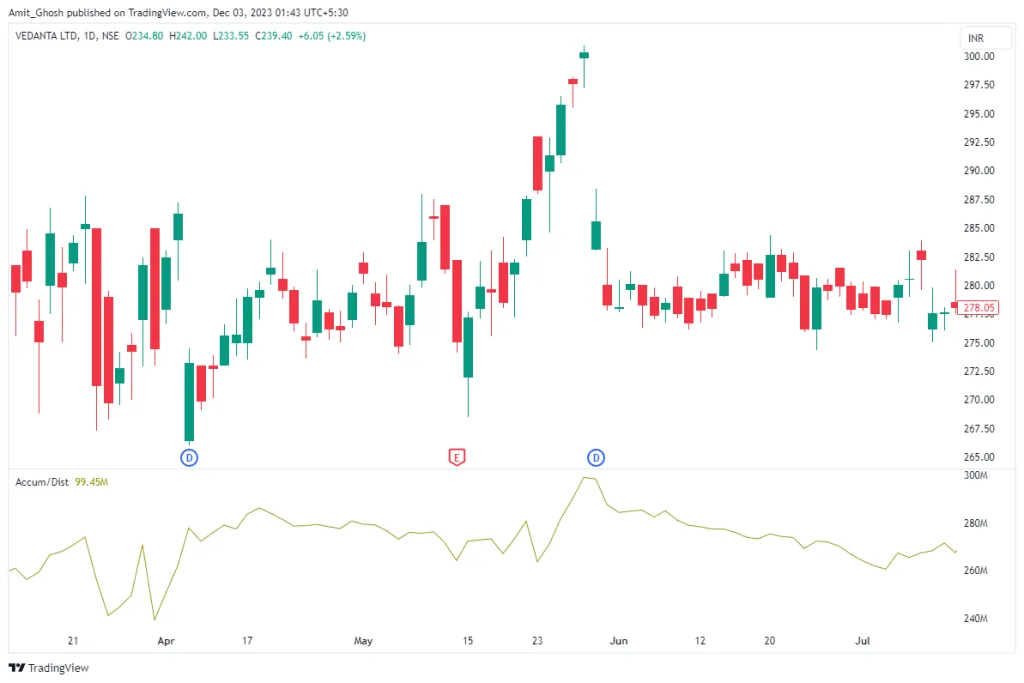
The chart of Vedanta above shows a sideways market where several divergences provided timely entry signals, leading to profitable trades.
Trending Markets
In strongly trending markets, using ADI to pick tops or bottoms (counter-trend trading) can be risky. A strong trend can generate multiple false divergence signals as the price pauses before continuing its primary direction.
To mitigate this, the ADI should be used in harmony with the prevailing trend.
- In a strong uptrend, look for bullish divergences on pullbacks to the trendline or a key moving average. This provides a lower-risk entry point to rejoin the trend.
- In a strong downtrend, look for bearish divergences on retracements (bounces) to find opportunities to initiate short positions.
This approach helps filter out low-probability signals and aligns your trades with the market’s dominant momentum.
Best Timeframes for Indian Markets
The reliability of the ADI depends on the chosen timeframe.
- Positional Trading: For NIFTY 50 stocks and other large-caps, the Daily and 75-minute charts often provide the most robust and clean ADI signals. These higher timeframes filter out intraday noise and highlight more significant accumulation and distribution patterns.
- Intraday Trading: The 15-minute chart can be used for intraday setups, but it will generate more frequent signals, including false ones. A trader using ADI on this timeframe must be nimble and employ strict risk management. The 5-minute chart is generally too noisy for reliable divergence signals with the ADI.
Conclusion
The Accumulation/Distribution Indicator is a valuable tool for looking beneath the surface of price action to understand the flow of volume.
- The ADI is a cumulative indicator that tracks the flow of volume into or out of a security.
- Its primary strength lies in identifying bullish and bearish divergences, which often act as leading signals for trend reversals.
- A rising ADI indicates accumulation (buying pressure), while a falling ADI signifies distribution (selling pressure).
- The ADI should not be used in isolation. Always seek confirmation from other tools like trendlines, moving averages, or price patterns before entering a trade.
- In trending markets, use the ADI to find entries in the direction of the trend, not against it.