Plotting Zerodha OHLC to Candlestick Chart

This is a programming lesson. So there will be very less amount of explanation and more code. If you’re stuck somewhere, feel free to comment.
Objective
Plotting Candlestick Chart from Open, High, Low, Close data
Note – The structure of historical data and live data from Zerodha is identical. During the development and testing of functions, it’s not feasible to wait for days or months to validate their performance using live data.
To address this, we’ll initially test and validate our functions using historical data. Once we have confirmed that the functions generate accurate signals and execute trades correctly with historical data, we can seamlessly transition to using live data for real-time trading.
Python Code
import pandas as pd
import mplfinance as mpf
# Assuming 'zap' is your DataFrame
# Convert the 'date' column to datetime and set it as index
zap['date'] = pd.to_datetime(zap['date'])
zap.set_index('date', inplace=True)
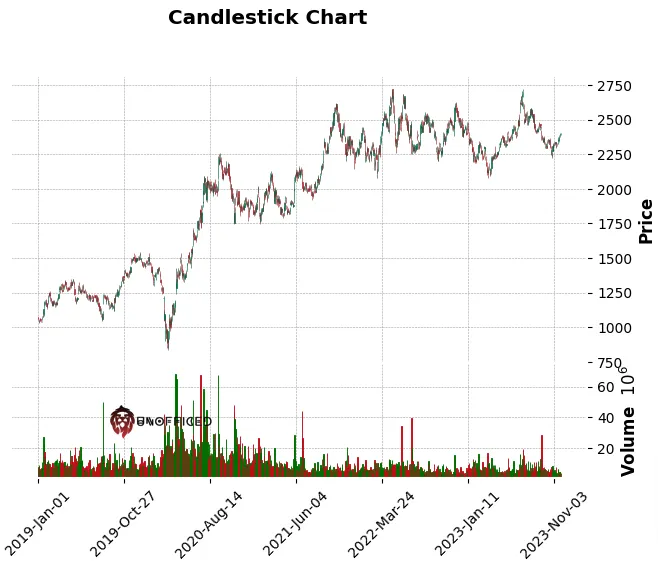
# Plotting the candlestick chart
mpf.plot(zap, type='candle', style='charles', title="Candlestick Chart", volume=True)
Output –
					   date     open     high      low    close   volume
0 2019-01-01 00:00:00+05:30  1072.60  1074.55  1058.15  1068.55  4674623
1 2019-01-02 00:00:00+05:30  1062.35  1074.25  1049.45  1054.60  7495774
2 2019-01-03 00:00:00+05:30  1055.65  1062.45  1039.05  1041.60  7812063
3 2019-01-04 00:00:00+05:30  1046.05  1052.75  1030.50  1047.25  8880762
4 2019-01-07 00:00:00+05:30  1055.20  1066.10  1049.45  1053.05  5784264
5 2019-01-08 00:00:00+05:30  1053.35  1058.00  1044.70  1052.95  5901337
6 2019-01-09 00:00:00+05:30  1059.95  1064.70  1047.30  1058.75  6049944
7 2019-01-10 00:00:00+05:30  1055.90  1059.00  1051.40  1055.65  4280617
8 2019-01-11 00:00:00+05:30  1055.75  1061.65  1037.65  1046.65  6781268
9 2019-01-14 00:00:00+05:30  1043.75  1049.00  1035.55  1045.45  4313662
Plot Candlestick Chart - Using MPLFinance
mplfinance is a library for financial data visualization. It extends matplotlib, a core plotting library in Python, to provide functionalities specifically for financial data like candlestick charts.
					import pandas as pd
import mplfinance as mpf

# Assuming 'zap' is your DataFrame
# Convert the 'date' column to datetime and set it as index
zap['date'] = pd.to_datetime(zap['date'])
zap.set_index('date', inplace=True)

# Plotting the candlestick chart
mpf.plot(zap, type='candle', style='charles', title="Candlestick Chart", volume=True)
pd.to_datetime(zap['date']): Converts the ‘date’ column in the DataFrame zap into datetime objects. This is important for correctly plotting time series data.
Also, this following line needs detailed explantion –
mpf.plot(zap, type='candle', style='charles', title="Candlestick Chart", volume=True)
mpf.plot(): The main function from themplfinancelibrary to plot financial data. It takes several arguments for customization.zap: The DataFrame to be plotted. It must be indexed by datetime (as set in the previous step) and contain columns for ‘open’, ‘high’, ‘low’, and ‘close’ prices.type='candle': Specifies that the plot should be a candlestick chart. Each “candle” in the chart represents four price points (open, high, low, close) for a particular time period.style='charles': This sets the visual style of the chart. ‘charles’ is one of the predefined styles inmplfinance, which determines the color scheme and layout of the chart.title="Candlestick Chart": Sets the title of the chart.volume=True: This argument, when set toTrue, includes a volume subplot in the chart. Volume represents the number of shares or contracts traded in a security or market during a given period.
Output –
Plot Candlestick Chart - Using Plotly
Plotly is a popular interactive graphing library. It offers a range of plotting capabilities, including financial charts like candlesticks. But Plotly will take considerably huge amount of time compared to MPLFinance. So, Lets truncate the zap dataframe to take the last 100 rows only.
					zap = zap.tail(100)
zap
you can use zap = zap.tail(100) to slice the DataFrame and keep only the last 100 rows. This statement effectively overwrites the zap variable with a new DataFrame containing just the last 100 rows of the original data. After executing this line, any operations you perform on `
Output –
					date	open	high	low	close	volume
1116	2023-07-04 00:00:00+05:30	2502.15	2502.15	2452.80	2467.60	3903114
1117	2023-07-05 00:00:00+05:30	2486.90	2486.90	2455.25	2463.55	4961687
1118	2023-07-06 00:00:00+05:30	2455.50	2520.70	2455.50	2515.25	9256137
1119	2023-07-07 00:00:00+05:30	2511.70	2540.25	2505.00	2510.35	6475750
1120	2023-07-10 00:00:00+05:30	2563.05	2627.00	2549.80	2607.05	16093438
...	...	...	...	...	...	...
1211	2023-11-20 00:00:00+05:30	2348.55	2358.40	2336.40	2349.35	2245093
1212	2023-11-21 00:00:00+05:30	2366.00	2388.00	2360.20	2378.90	4107225
1213	2023-11-22 00:00:00+05:30	2375.00	2394.45	2372.20	2388.20	4267407
1214	2023-11-23 00:00:00+05:30	2388.20	2400.00	2388.20	2395.50	4265771
1215	2023-11-24 00:00:00+05:30	2391.60	2402.60	2391.05	2393.90	3374743
100 rows × 6 columns
Now, Lets run the code –
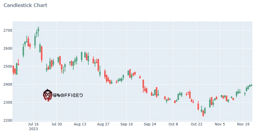
					import plotly.graph_objects as go

# Convert 'date' to string for Plotly compatibility
zap['date_str'] = zap['date'].dt.strftime('%Y-%m-%d')

fig = go.Figure(data=[go.Candlestick(x=zap['date_str'],
                open=zap['open'], high=zap['high'],
                low=zap['low'], close=zap['close'])])

fig.update_layout(title='Candlestick Chart', xaxis_rangeslider_visible=False)
fig.show()
It gives an entirely blank output if you are using Jupyter Notebook. In Jupyter Notebook, you need to enable Plotly’s notebook mode for interactive charts. Add this at the beginning of your notebook:
					#Add This
import plotly.io as pio
pio.renderers.default = 'notebook'

import plotly.graph_objects as go

# Convert 'date' to string for Plotly compatibility
zap['date_str'] = zap['date'].dt.strftime('%Y-%m-%d')

fig = go.Figure(data=[go.Candlestick(x=zap['date_str'],
                open=zap['open'], high=zap['high'],
                low=zap['low'], close=zap['close'])])

fig.update_layout(title='Candlestick Chart', xaxis_rangeslider_visible=False)
fig.show()
The output comes perfectly now –
Plot Candlestick Chart - Using Bokeh
Bokeh is a powerful and versatile interactive visualization library for Python, renowned for its ability to create complex and aesthetically pleasing plots with ease.
Now, We need to Make sure you’ve imported output_notebook from bokeh.plotting in addition to the other necessary functions. And then calloutput_notebook(): This function will direct Bokeh to display plots inline in the Jupyter Notebook.
from bokeh.plotting import figure, show, output_notebook
from bokeh.models import ColumnDataSource
# Initialize output to notebook
output_notebook()
# Assuming 'zap' is your DataFrame
# Slicing to get the last 100 rows
zap_last_100 = zap.tail(100)
zap_last_100_cds = ColumnDataSource(zap_last_100)
# Create figure with correct attributes
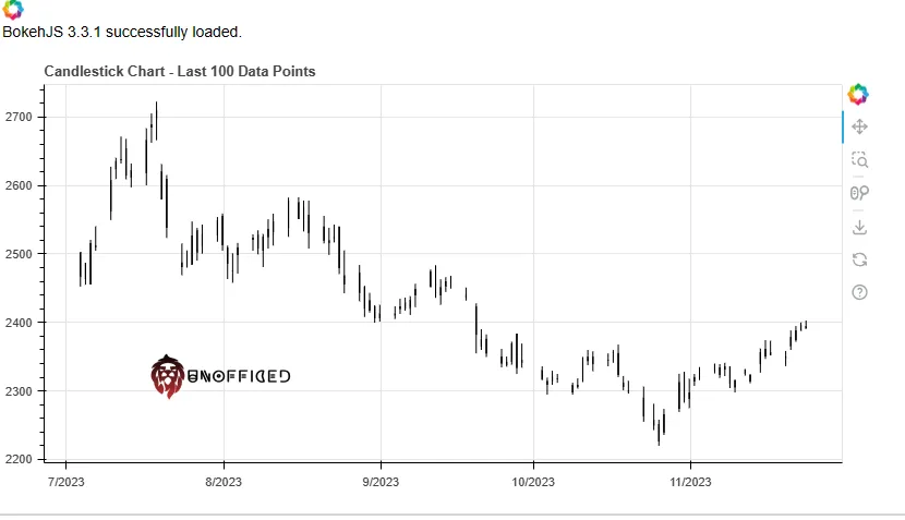
p = figure(x_axis_type="datetime", title="Candlestick Chart - Last 100 Data Points", width=800, height=400)
# Draw segments and bars for candlesticks
p.segment('date', 'high', 'date', 'low', source=zap_last_100_cds, color="black")
p.vbar('date', 0.5, 'open', 'close', source=zap_last_100_cds, fill_color="#D5E1DD", line_color="black")
# Show the plot in the notebook
show(p)
Output –