Analyzing Trading Metrics and Generating Graphs from Final Trade Logs

Calculate Trading Performance Metrics
Once we have the final trade log as a CSV file, we can use the Pandas library in Python to compute a wide range of performance metrics. This analysis is crucial for objectively evaluating the effectiveness and risk profile of our trading strategy. The following script ingests the trade log and calculates key statistics.
import pandas as pd

# Assuming 'df' is the DataFrame loaded from your trade log CSV
# df = pd.read_csv('final_tradelog.csv')

net_pl = round(df["pl"].sum(), 2)
print("Net P&L:", net_pl)

total_trades = len(df)
num_stop_loss_hits = len(df[df['is_sl']])
num_target_hits = total_trades - num_stop_loss_hits
print(f"Number of total trades: {total_trades}")
print(f"Number of times target is hit: {num_target_hits}")
print(f"Number of times stop loss is hit: {num_stop_loss_hits}")

win_ratio = round(num_target_hits / total_trades, 2)
print(f"Win Ratio: {win_ratio}")

avg_pl = round(df['pl'].mean(), 2)
max_pl = round(df['pl'].max(), 2)
min_pl = round(df['pl'].min(), 2)
print(f"Avg PL: {avg_pl}")
print(f"Max PL: {max_pl}")
print(f"Min PL: {min_pl}")

gross_profit = round(df[df['pl'] > 0]['pl'].sum(), 2)
gross_loss = round(df[df['pl'] < 0]['pl'].sum(), 2)
print(f"Gross Profit: {gross_profit}")
print(f"Gross Loss: {gross_loss}")

profit_factor = 0
if gross_loss != 0:
    profit_factor = round(abs(gross_profit / gross_loss), 2)
print(f"Profit Factor: {profit_factor}")

expected_payoff = round(df['pl'].mean(), 2)
print(f"Expected Payoff: {expected_payoff}")

df['cumulative_pl'] = df['pl'].cumsum()
df['high_water_mark'] = df['cumulative_pl'].cummax()
df['drawdown'] = df['high_water_mark'] - df['cumulative_pl']
max_drawdown = round(df['drawdown'].max(), 2)
print(f"Maximum Drawdown: {max_drawdown}")

# Assuming a risk-free rate of 7% for India, or 0.07
risk_free_rate = 0.07
daily_returns = df['pl'] / 100000 # Assuming a capital of Rs. 1,00,000 for calculation
sharpe_ratio = round((daily_returns.mean() * 252 - risk_free_rate) / (daily_returns.std() * (252**0.5)), 2)
print(f"Sharpe Ratio: {sharpe_ratio}")

recovery_factor = 0
if max_drawdown > 0:
    recovery_factor = round(net_pl / max_drawdown, 2)
print(f"Recovery Factor: {recovery_factor}")

# Calculate max consecutive wins and losses
wins = df['pl'] > 0
losses = df['pl'] < 0
max_wins = wins.groupby((wins != wins.shift()).cumsum()).cumsum().max()
max_losses = losses.groupby((losses != losses.shift()).cumsum()).cumsum().max()
print(f"Maximum consecutive wins: {max_wins}")
print(f"Maximum consecutive losses: {max_losses}")

# Calculate holding time metrics
df["Triggered at"] = pd.to_datetime(df["Triggered at"])
df["square_off_time"] = pd.to_datetime(df["square_off_time"])
df["holding_time"] = df["square_off_time"] - df["Triggered at"]
avg_holding_time = df["holding_time"].mean()
print(f"Average holding time: {avg_holding_time}")

profit_trades = df[df["pl"] > 0]
avg_profit_holding_time = profit_trades["holding_time"].mean()
print(f"Average holding time for profit trades: {avg_profit_holding_time}")

loss_trades = df[df["pl"] < 0]
avg_loss_holding_time = loss_trades["holding_time"].mean()
print(f"Average holding time for loss trades: {avg_loss_holding_time}")
Executing this script produces a detailed summary of the backtest results.
| Metric | Value |
|---|---|
| Net P&L | Rs. 1,66,658.75 |
| Total Trades | 44 |
| Target Hits | 25 |
| Stop Loss Hits | 19 |
| Win Ratio | 0.57 |
| Average P&L per Trade | Rs. 3,787.70 |
| Maximum P&L in a Trade | Rs. 25,875.00 |
| Minimum P&L in a Trade | Rs. -15,847.50 |
| Gross Profit | Rs. 2,41,056.25 |
| Gross Loss | Rs. -74,397.50 |
| Profit Factor | 3.24 |
| Expected Payoff | Rs. 3,787.70 |
| Maximum Drawdown | Rs. 25,945.00 |
| Sharpe Ratio | 0.42 |
| Recovery Factor | 6.42 |
| Maximum Consecutive Wins | 5 |
| Maximum Consecutive Losses | 4 |
| Average Holding Time | 0 days 04:44:50 |
| Avg Holding Time (Profit Trades) | 0 days 05:29:34 |
| Avg Holding Time (Loss Trades) | 0 days 03:40:13 |
Interpretation of Metrics
These numbers give us a quantitative snapshot of the strategy's behaviour.
- Profit Factor: A value of 3.24 is strong. It indicates that for every rupee lost, the strategy made Rs. 3.24 in profit. A value greater than 1 is profitable; above 2 is generally considered good.
- Maximum Drawdown: This is the peak-to-trough decline in capital. Our maximum drawdown was Rs. 25,945. This figure is critical for risk management and determining position sizing. You must be able to withstand this level of loss.
- Win Ratio vs. Holding Time: The strategy wins 57% of the time. Interestingly, the average holding time for profitable trades is significantly longer than for losing trades. This suggests the strategy is good at "letting winners run" while "cutting losers short."
Visualizing Backtest Performance
While numerical metrics are essential, visual plots provide an intuitive understanding of performance over time. We will use the matplotlib library to generate two key charts.
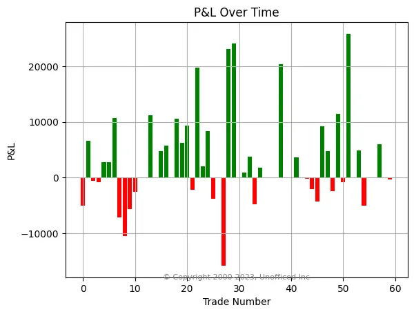
Trade-by-Trade Profit & Loss
This bar chart shows the P&L for each individual trade, allowing us to quickly identify the magnitude of wins and losses.
import matplotlib.pyplot as plt

# Set the color of the bars based on positive or negative values
colors = ['g' if pl >= 0 else 'r' for pl in df['pl']]

# Create the bar chart
plt.figure(figsize=(10, 6))
plt.bar(df.index, df['pl'], color=colors)

# Set the labels and title
plt.xlabel("Trade Number")
plt.ylabel("P&L (in Rs.)")
plt.title("Trade-by-Trade P&L")
plt.grid(axis='y', linestyle='--', alpha=0.7)

# Add copyright
plt.text(0.99, 0.01, "© unofficed.com",
         horizontalalignment='right', verticalalignment='bottom',
         transform=plt.gca().transAxes, fontsize=8, color='gray')

# Show the plot
plt.show()
The resulting graph provides a clear visual sequence of winning (green) and losing (red) trades.
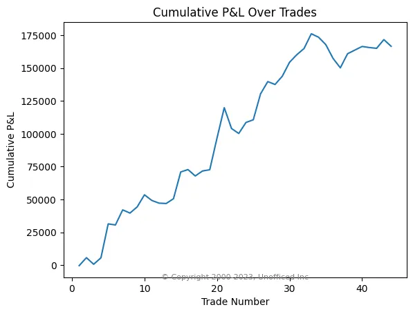
Cumulative P&L Curve (Equity Curve)
The equity curve is one of the most important visualizations for a backtest. It plots the cumulative profit or loss over the sequence of trades, showing the growth of the account over time.
import matplotlib.pyplot as plt

# Calculate cumulative P&L
cum_pl = df["pl"].cumsum()
trade_num = range(1, len(df)+1)

# Create the line plot
plt.figure(figsize=(10, 6))
plt.plot(trade_num, cum_pl, marker='o', linestyle='-', markersize=4)
plt.title('Cumulative P&L Over Trades (Equity Curve)')
plt.xlabel('Trade Number')
plt.ylabel('Cumulative P&L (in Rs.)')
plt.grid(True, linestyle='--', alpha=0.7)

# Add copyright
plt.text(0.99, 0.01, "© unofficed.com",
         horizontalalignment='right', verticalalignment='bottom',
         transform=plt.gca().transAxes, fontsize=8, color='gray')

plt.show()
A steadily rising curve is ideal. Plateaus represent periods of no trading or flat performance, while dips represent drawdowns.