
Market Volatility

In this lesson, you will learn:
- What market volatility is and why it is crucial for traders.
- How to measure volatility using standard technical indicators.
- How to interpret volatility for making trading decisions in Indian markets.
What is Market Volatility?
In financial markets, volatility is the statistical measure of the dispersion of returns for a given security or market index. In simpler terms, volatility measures how much the price of an asset fluctuates over a specific period. The more an asset’s price changes, the higher its volatility.
From a trader’s perspective, volatility is a double-edged sword:
- High Volatility: Indicates large price swings, presenting greater profit opportunities but also carrying higher risk. Trend and breakout traders thrive in high-volatility environments.
- Low Volatility: Characterised by small price movements. This suggests lower immediate risk but also limited profit potential. These periods are often seen as consolidation before a significant move.
As a trader, your goal is to capitalise on price movement. Therefore, understanding and identifying volatile periods is essential for increasing profit potential. Volatility isn’t about the direction of the price move, but the magnitude of it.
How to Measure Volatility
While volatility can be observed simply by looking at price action, technical indicators provide a quantitative way to measure it. The most common tools used by traders on the NSE and other markets include:
- Bollinger Bands (BB): A visual tool that shows volatility relative to a moving average.
- Average True Range (ATR): An indicator that provides a specific value for an asset’s price range.
- Standard Deviation: The underlying statistical measure for many volatility indicators.
Let’s explore how to use these tools to analyse and trade based on volatility.
Method 1: Bollinger Bands
Developed by John Bollinger, Bollinger Bands are one of the most effective tools for visualising volatility. They consist of three lines plotted over the price chart:
- A Simple Moving Average (SMA) that forms the middle band.
- An upper band, typically set at two standard deviations above the middle band.
- A lower band, typically set at two standard deviations below the middle band.
Standard deviation is a measure of how spread out numbers are from their average. When applied to price, it directly measures volatility.
The Bollinger Band Formula
The calculation for the bands is straightforward:
Middle Band: 20-period Simple Moving Average (SMA)
Upper Band: Middle Band + (2 * 20-period Standard Deviation)
Lower Band: Middle Band – (2 * 20-period Standard Deviation)
Where:
- = Number of periods (typically 20)
- = Number of standard deviations (typically 2)
- = Standard Deviation over N periods
Reading Volatility with Bollinger Bands
The distance between the upper and lower bands is directly proportional to volatility.
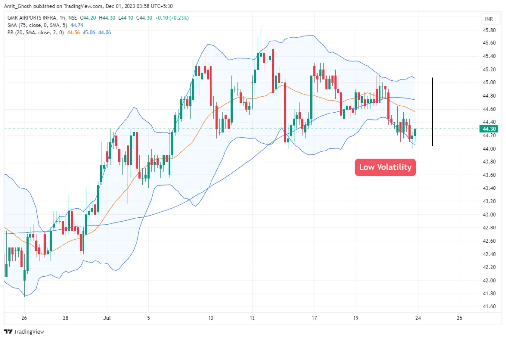
- Band Squeeze (Low Volatility): When the bands contract and move closer together, it signals that volatility has decreased. This period of consolidation or “squeeze” often precedes a significant price move. Traders watch these squeezes to position themselves for a potential breakout.
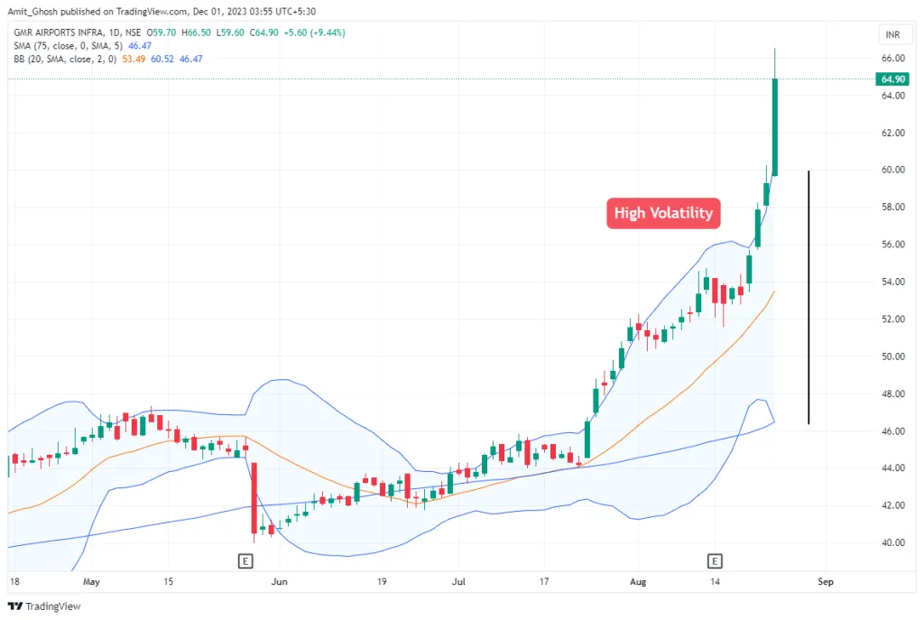
- Band Expansion (High Volatility): When the bands expand and move further apart, it signals that volatility has increased. This typically happens during strong trends or after a news-driven event.
Method 2: Average True Range (ATR)
Developed by J. Welles Wilder Jr., the Average True Range (ATR) is a pure volatility indicator. Unlike Bollinger Bands, which are plotted on the price chart, ATR is displayed in a separate pane below. It provides a single line representing the average “true range” of an asset over a given number of periods.
The ATR Formula
The calculation starts with finding the **True Range (TR)** for each period. The TR is the greatest of the following three values:
- The current period’s High minus the current period’s Low
- The absolute value of the current period’s High minus the previous period’s Close
- The absolute value of the current period’s Low minus the previous period’s Close
Where is the current high, is the current low, and is the previous close.
The ATR is then calculated as a smoothed moving average of the TR values, typically over 14 periods. Wilder’s smoothing method is used:
Where is the number of periods (usually 14).
How to Read the ATR
The ATR value is expressed in the same units as the price. For example, if NIFTY has an ATR of 120, it means that the index has moved, on average, 120 points per period over the last 14 periods.
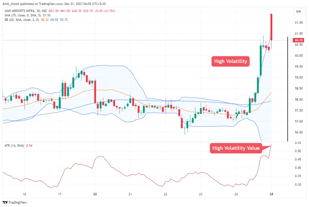
- Rising ATR: Indicates that volatility is increasing. The price ranges of the candles are getting larger. This suggests a strengthening trend or panic selling.
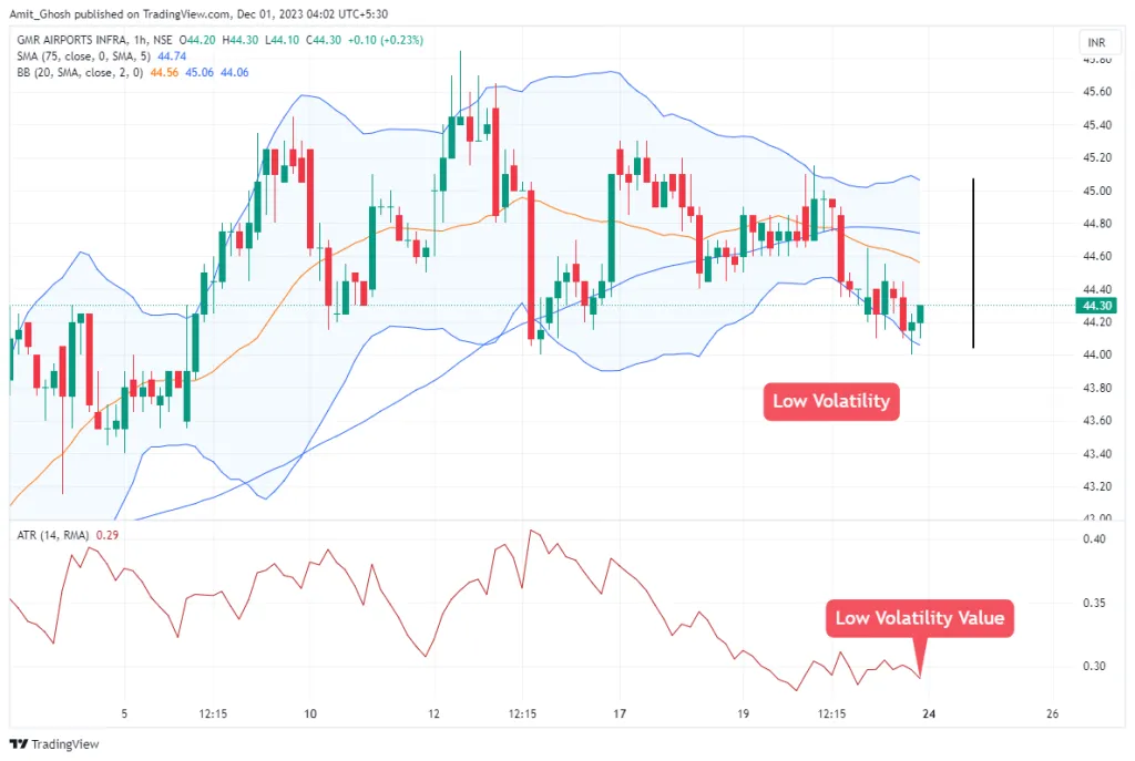
- Falling ATR: Indicates that volatility is decreasing. Price ranges are narrowing, suggesting a consolidating or ranging market.
It is critical to remember that ATR does not indicate price direction. A rising ATR can occur in a strong uptrend or a sharp downtrend.
Trading Uses of ATR
- Setting Stop-Losses: ATR is invaluable for setting volatility-adjusted stop-losses. For example, a common technique is to place a stop-loss at 2 times the ATR value below the entry price for a long trade. This adapts your risk to the current market environment.
- Position Sizing: By understanding the typical price movement (the ATR), you can adjust your position size. In highly volatile stocks (high ATR), you might take a smaller position to maintain a consistent risk in Rupee terms.
- Breakout Confirmation: A breakout from a consolidation range accompanied by a sharp increase in ATR is a more reliable signal than one with low or decreasing ATR.
Best Timeframes for Indian Markets
Volatility analysis is timeframe-dependent. A stock can be volatile on a 5-minute chart but quiet on a daily chart. For active trading on the NSE:
- Intraday Trading: For stocks in the F&O segment and indices like NIFTY and BANKNIFTY, the 5-minute and 15-minute charts provide a good balance of detail and signal clarity for volatility analysis.
- Swing Trading: When holding positions for a few days to weeks, the 75-minute and Daily charts are excellent. Volatility patterns on these higher timeframes, such as a multi-day Bollinger Band squeeze, can lead to powerful and sustained moves.
In summary, volatility is the engine of the market. While low volatility indicates a resting phase, high volatility represents the periods of opportunity where significant profits can be made. By using tools like Bollinger Bands and ATR, you can quantify this volatility and make more informed trading decisions.