Creating Dynamic Heatmap for Indian Stock Market
One can mostly classify traders as a mean reversion trader (i.e. who bets on the reversal of the trend) and as a breakout trader (i.e who bets on the direction of the trend).
- It is impossible to track all the stocks from Watchlist in one glance. Here is where Heatmap plays an important role. Since the price of the stock changes every movement, a heatmap shows a consolidated view on what is happening on the stock on the moment.
- The breakout traders scan for the stocks which are gaining momentum and the stocks who already made a huge move and can make even more strong move in the same direction.
- Vice versa, a mean reversion trader will tend to scan the stocks which went up higher for the trade and will bet on the retracement when there is a sign of weakness. (In Entropy, We use Bollinger Bands to validate when to enter.)
So, let’s take our journey of data visualization in Python forward. The first attempt to make the chart was over dynamic Treemap offered by Amcharts.
![]()
Although the heatmap looks beautiful, there are dozens of problems –
- There is a glitch in the value area. If you keep the chart open for some time, it will go weird.
- This whole concept of masonry (different size based on the percentage) is not at all ok. Sometimes, We look at the stocks which didn’t move at all in the middle of the day for possible breakouts. Right? (Like if all the stocks from the same sector went up and one stayed at the same place is a good stock to scan if it is a long.)
- The colour is coming from the percentage and random. It reminds me of the t-shirt of Ranbir Singh from Ram Leela.
- It doesn’t take negative values. So, we create two heatmaps – One with positive stocks going up and another with negative stocks going down.
- Now NSE doesn’t allow to take the data directly from their server! So, We need to make a program that repeated downloads that data and saves to our server!
What is a heatmap?
A heat map is a graphical representation of data where the individual values contained in a matrix are represented as colours. “Heat map” is a newer term but shading matrices have existed for over a century. Heatmaps can also be of many forms. It is all about visual representation.

Now to generate heatmap, all we needed is to create a table and the colour to quantify its price movements! The animation is useless in real-time data because it will be chaos due to so much data.
So, we will update it in each 5 minutes interval!
The HTML Table
The primary goal here is to create a heatmap for all the stocks which are in the FNO segment listed on the National Stock Exchange of India Ltd (NSE). Our HTML heatmap will the stock symbols and its respective single-day percentage price change and it will be coloured accordingly.
We collate the required market data from NSE and construct an HTML table. Although the number of companies in the list is fixed as of now i.e. 200, we are not sure if it will stay the same in the future. We are dividing the rows after each 13th item. Further, we want our seaborn heatmap to display the percentage price change for the stocks in a descending order.
The first task is completed.
There are two ways of representations in HTML.
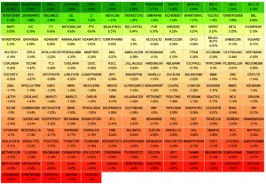
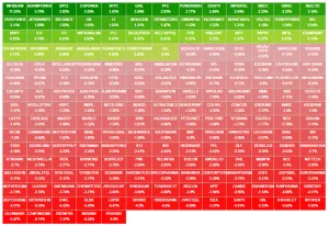
- Image A – Yellow is the middle colour between Green and Red. So it is a Green to Red transition in a proper sense. Here goes the code.
- Image B – It is basically green ending in lighter green and red ending in darker red. Although Image A is theoretically correct, Image B is more practical. It gives the contrast! Here goes the code.
Using Python to Create Dynamic HTML Heatmap
Python Script Uploading files via FTP
The first problem is to sync it to the web server. Currently, I am using Digital Ocean for Python works as I get tons of free credit from them. They are very easy to use and most importantly, the server is glitch free! You can use my link to get 50$ free credit to test out.
So, coming back to the point. Use ftplib, you can write it like this:
import ftplib
session = ftplib.FTP('server.address.com','USERNAME','PASSWORD')
file = open('kitten.webp','rb')                  # file to send
session.storbinary('STOR kitten.webp', file)     # send the file
file.close()                                    # close file and FTP
session.quit()
Create Color Gradient Array Using Python
Now the second task is to dynamically generate the colour. Now we have two sets of gradients –
- A – Green ending in lighter green.
- B – Red ending in darker red.
So, we need to calculate the number of positive stocks in total. Then make a gradient of type A mentioned above into them. Similarly, goes for the negative stock
positions = requests.get('https://www.nseindia.com/live_market/dynaContent/live_watch/stock_watch/foSecStockWatch.json').json()
endp = len(positions['data'])

positive_stocks=0
i=0
for x in range(i, endp):
value = float(positions['data'][x]['per'])
if value >= 0 : positive_stocks = positive_stocks+1
negative_stocks = endp-positive_stocks
Then, we shall just use the colour package. Here goes the basic usage –
from colour import Color
red = Color("red")
colors = list(red.range_to(Color("green"),10))

# colors is now a list of length 10
# Containing:
# [<Color red>, <Color #f13600>, <Color #e36500>, <Color #d58e00>, <Color #c7b000>, <Color #a4b800>, <Color #72aa00>, <Color #459c00>, <Color #208e00>, <Color green>]
So, We modify it to our needs –
from colour import Color
positive_colors = list(Color("green").range_to(Color("#BDD051"),positive_stocks))
negative_colors = list(Color("#DFA4A4").range_to(Color("red"),negative_stocks))
Dynamic Table Generation
The third and final step is to generate the table dynamically! We are getting the data from NSE as JSON format. Let’s write down our complexity on the algorithm –
- We need to create a new row after n number of data. Here, We have chosen to create a new row at every 13th element.
- We need to sort the table. A good thing is NSE’s given data comes already sorted!
Now, to deploy colours, We need another loop –
- We need to check if the data given has a positive change. As the first data which we will get will have the highest positive change, We need to assign the colour in that order.
- Similarly, We need to check if the data given has a negative change. As the first data which we will get will have the least negative change, We need to assign the colour in that order.
Running the Program Automatically
So, We need to a setup cron job. Cron is a scheduling daemon that executes tasks at specified intervals. These tasks are called cron jobs and are mostly used to automate system maintenance or administration.
You can schedule cron jobs to run by the minute, hour, a day of the month, month, a day of the week or any combination of these. Crontab (cron table) is a text file that specifies the schedule of cron jobs. There are two types of crontab files. The system-wide crontab files and individual user crontab files. Users crontab files are stored by the user’s name and their location varies by operating systems.
You can read more here. You need to know two things –
- The python installation path in the Ubuntu shell. Use the command:
which pythonIt returns
/usr/bin/pythonfor Digital Ocean droplet we are using. - The path of the python script to execute. Use the command:
pwd
It returns
/root/heatmap/for Digital Ocean droplet we are using. - Make the script (Here the script’s name is main.py) executable by:
chmod u+x /root/heatmap/main.py - Open your cron table by
crontab -e - Add the following
cronentry:*/10 * * * * /usr/bin/python /root/heatmap/main.py
That’s it! It will run every 10 minutes. Now let’s define all the code inside the function heatmap(). We will run another function to check if it is market time i.e. 9:15 to 15:30. It will skip running the program unless it is market time.
import datetime
current_time = datetime.datetime.now().time()

start_time = "09:10" #UTC Times
end_time = "15:30"

start_hour = int(str(start_time)[:2])
start_min = int(str(start_time)[:5][-2:])

end_hour = int(str(end_time)[:2])
end_min = int(str(end_time)[:5][-2:])

def heatmap():
#Rest of the code goes here

def job ():
if (current_time.hour>start_hour and current_time.hour<end_hour) : heatmap() elif (current_time.hour==start_hour and current_time.minute>=start_min)  :  heatmap()
elif (current_time.hour==end_hour and current_time.minute<=end_min)  :  heatmap()
else : pass
The Final Product
The data is coming directly from the JSON file. So, We are basically waiting till they block us. It auto-refreshes itself every 5 minutes. The resource will be low as it is within an iframe.


is it possible to run this locally in a computer
You can code it using Node.JS.
NEED HELP FOR PYTHON TRAINING