Candlestick Charts in Python with NSEPython and Plotly
Candlestick Charts in Python Using Plotly and NSEPython
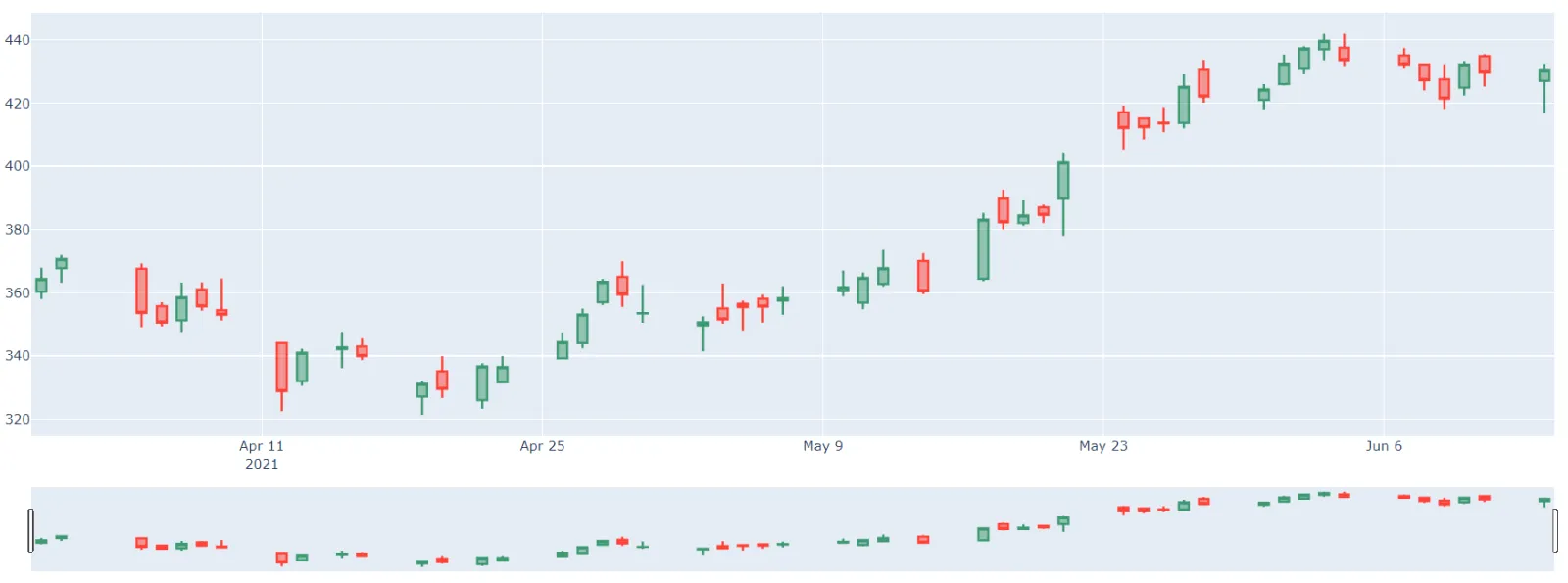
The candlestick chart is a style of financial chart describing open, high, low, and close for a given x coordinate (most likely time).
- The boxes represent the spread between the open and close values and the lines represent the spread between the low and high values.
- Sample points where the close value is higher (lower) than the open value are called increasing (decreasing).
- By default, increasing candles are drawn in green whereas decreasing are drawn in red.
Simple Candlestick with Pandas
We shall be using equity_history() function of NSEPython.
NSEPython is a python wrapper coded by us only to scrap values from the NSE India website. Here is a basic construction of Pandas Dataframe with 365 days of data of SBI Equities –
					from nsepython import *

end_date = datetime.datetime.now().strftime("%d-%m-%Y")
end_date = str(end_date)

start_date = (datetime.datetime.now()- datetime.timedelta(days=65)).strftime("%d-%m-%Y")
start_date = str(start_date)

symbol = "SBIN"
series = "EQ"

df = equity_history(symbol,series,start_date,end_date)
Plotting Candle Stick Charts Using Python
Here is the second part of the code that uses Plotly library to draw Candlestick Chart from the data We just fetched –
					import plotly.graph_objects as go

fig = go.Figure(data=[go.Candlestick(x=df['CH_TIMESTAMP'],
                open=df['CH_OPENING_PRICE'],
                high=df['CH_TRADE_HIGH_PRICE'],
                low=df['CH_TRADE_LOW_PRICE'],
                close=df['CH_CLOSING_PRICE'])])

fig.show()

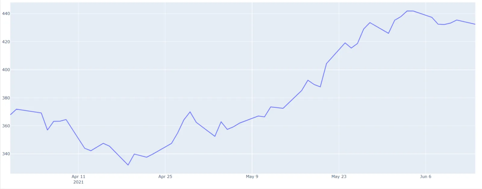
Plotting Time Series Line Chart Using Python
You can switch the the second part of the code that uses Plotly library to draw Candlestick Chart from the data in the previous section with this patch of code –
					import plotly.graph_objects as go

fig = go.Figure([go.Scatter(x=df['CH_TIMESTAMP'], y=df['CH_TRADE_HIGH_PRICE'])])
fig.show()
In Financial Application, Time Series chart is default to date axis. Here is how the line chart will look in the output –


i want to fetch live data in the chart. is it posssible ? If yes, then how?